How It Works

Colour Adjustment Settings

Colour Blindness: People who are colour blind may not perceive the differences between colours or see contrasting colors that are essential for making it easy to navigate websites. A colour-blind user may have difficulty discerning linked text, buttons, icons, and other UI (user interface) features. 

Low Vision: People with low vision have reduced visual acuity and may benefit from high-contrast elements.

Cognitive Disabilities: People with Cognitive Disabilities might benefit from low saturation. Certain individuals benefit from lower saturation because it allows them to focus and concentrate on important content and avoid distractions. 

Light Sensitivity: People with light sensitivity have difficulty with white backgrounds and may prefer different text and headline colour combinations. 

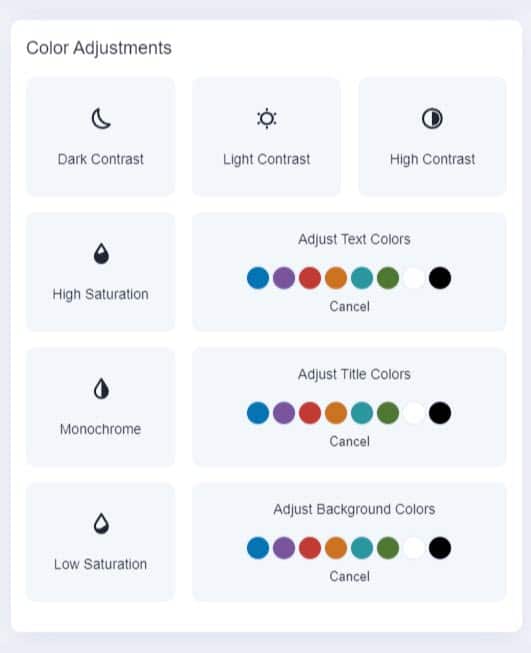
Colour Adjustments: High Contrast, High Saturation, Low Saturation, Dark Contrast, Light Contrast, Monochrome, Text Colourization, Title Colourization, and Background Colourization.

Color Adjustments Settings

People with specific visual impairments need to make additional adjustments to specific content elements.

Play Video

Low Saturation

Standard-Default-without-header.jpg Color-Adjustments-Low-Saturation.jpg

See how the screen appears when activating the accessibility settings. Move the slider left or right < > to see the contrast. 

Dark Contrast

Standard-Default-without-header.jpg Color-Adjustments-Dark-Contrast.jpg

See how the screen appears when activating the accessibility settings. Move the slider left or right < > to see the contrast. 

Change Text Colours

Standard-Default-without-header.jpg Color-Adjustments-Change-Text-Colors.jpg

See how the screen appears when activating the accessibility settings. Move the slider left or right < > to see the contrast. 

Make Your Website Accessible